What Your Online Marketing Dashboard Should Look Like
Last week I talked a lot about the increasing value of social media and mobile marketing in the online marketing landscape. Of course, your mileage may vary, based on both your specific goals and your specific tactics to achieve those goals.
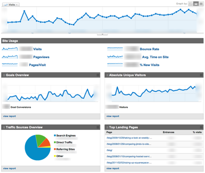
But, no matter which tactics you choose, your business needs a simple way of measuring what’s working and what isn’t, whether it’s search, social, mobile or something else altogether. Fortunately, just about every analytics tool on the market makes it easy to put together a dashboard showing the metrics you care about most. For example, here are my favorite online marketing metrics laid out using Google Analytics’ dashboard:

I look at Visits right away (since experience suggests Visits represents a leading indicator for sales). The dashboard follows with:
- Overall Site Usage
- Goals
- Absolute Unique Visitors
- Traffic Sources
- Top Landing Pages
- Bounce Rate
Right there, on one page, without scrolling, I’m able to look at how many people came to the site, how many converted, where those people came from, where they started, and whether they stayed. That’s what a dashboard is supposed to do: Give you a quick summary to tell you the direction of your business without excess detail.
Does this dashboard meet the 7 criteria of successful web metrics? Pretty much. This dashboard is timely, trended, meaningful, precise and tied to business results. And a single click drills down into the areas that let me segment and action the data. So, I’d give it a solid B for meeting those criteria.
Does it answer every question you could have about your website or your business?
Nope. But, as I noted, the details are just a click away. A web analytics dashboard isn’t supposed to answer every question. It’s supposed to highlight where you should look to ensure your business is heading in the right direction.
One of the things many people I show this to note as “missing” is conversion rate. Except, it’s not missing. I include a capsule conversion rate report on the next page down, but I pay much more attention to the gross number of goals achieved (conversions) than to conversion rate itself. As we’ve looked at before, sometimes a falling conversion rate is a sign that you’re doing the right thing. If the number of goal conversions is moving in the right direction, conversion rate is a secondary (albeit still useful) metric.
Clearly, improving your online marketing depends on drilling down on each of these areas to gain a deeper understanding of your tactics’ successes and shortcomings. But, a well-structured dashboard will point you where to look first. Do you see something missing? Is there something you like to see in your business dashboard that’s missing here? Tell me about it in the comments below. And don’t forget to subscribe to Tim Peter Thinks for more e-commerce and online marketing insights every day.
Are you getting enough value out of your small business website? Want to make sure your business makes the most of the local, mobile, social web? thinks helps you understand how to grow your business via the web, every day. Get more than just news. Get understanding. Add Tim Peter Thinks to your feed reader today.
And while you’re at it, don’t forget to follow Tim on Twitter.
Tim Peter & Associates helps companies from startups to the Fortune 500 use the web to reach more customers, more effectively every day. Take a look and see how we can help you.
Technorati Tags:
analytics, bounce rate, call-to-action, continuous improvement, conversion, conversion rate, conversion rate optimization, Data-Driven Marketing, E-commerce, e-commerce, E-commerce strategy, e-marketing, ecommerce, google, internet business, internet marketing, marketing, marketing best practices, measurement, metrics, objectives, online marketing, performance, strategy, tools
Comments (0)
Leave a Reply
You must be logged in to post a comment.

[…] I mentioned yesterday in our look at online marketing dashboards, dashboards aren’t designed to answer every question about your online marketing. And […]
[…] week we’re looking tracking your online marketing. We started with a look at what your marketing dashboard should look like, then showed how to track online marketing effectiveness in Google […]
Good list, Tim. Is there a way to show revenue #’s?
[…] the last few days, we’ve looked closely at online marketing dashboards, using Google Analytics to measure your marketing effectiveness, and how to measure the value of […]
[…] solid online marketing dashboard makes it clear to your audience what your goals are and how well you’ve met them. Senior […]