Great promotions with bad execution equal bad promotions
Can you believe this?
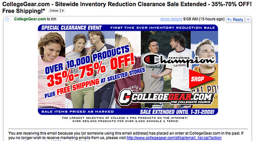
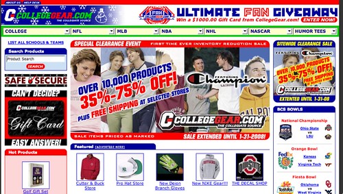
The huge image, offering a great deal on clearance merchandise, was not clickable in the email I received. Or on the home page of the site:
Nope. The clickable bit was actually the little 250×250 to the right of that big, juicy main promotional image. And I can’t find anything actually on sale.
Of course, that’s not the worst part. To add serious insult to injury, note all the Ohio State logos in my promotion. The only things I’ve ever bought from this site were for the University of Michigan. Do you think it’s possiible I might not be an (Oh, How I Hate) Ohio State fan?
This Post Has 0 Comments
Leave a Reply
You must be logged in to post a comment.


Nice! Completely agree that bad execution is just bad news. Great ideas are plenty, but are worthless if not executed properly.