Why splash screens suck (Guide to Small Business E-commerce Strategy)
A recent reader asked me some tough questions about e-commerce for small business. But e-commerce is a complex topic and each business’ needs is different. So, the best way to answer these questions is break down small business e-commerce into bite-sized chunks and look at just one feature at a time. I’ll write one or two posts each week to specific features and how they fit into a small business’ e-commerce strategy. This time up: splash pages.
Splash Pages
Many small businesses still use splash pages, a sexy graphic or Flash animation designed to highlight your business to potential customers. Don’t. They’re rude. They put your wishes ahead of your customers’. If your customer came to take a specific action (almost always the case) I’m betting watching your animation wasn’t it. And if it was, you can provide a link to a virtual tour or company presentation on the home page.
In fact, I’ve only seen a handful of splash pages that make sense. Here’s one:
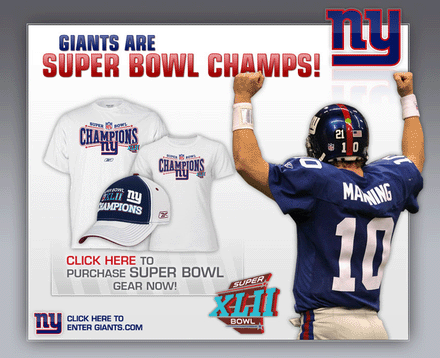
Note that this appeared on giants.com the day after the Giants won the Super Bowl. Fans heading to the team’s website immediately following the game likely had only a few goals:
- Find out who won the game
- Read about the team following its victory
- Purchase commemorative merchandise
The splash page in this case addresses all three issues. The team stripped their home page of any unnecessary messages by focusing, for a limited time, on the needs of its core customers following its win. And by offering a “Click here to enter Giants.com” they’re still making it easy for customers interested in other aspects of the team to accomplish their goals, too. One place the team could have done a better job is with an explicit link to more information about the team’s victory. While the entire image serves as such a link, it’s not obvious at first glance.
None of this is to suggest you shouldn’t have large graphical images to represent your company where appropriate. Hotels, for instance, do very well when offering virtual tours to potential guests. But, they have the greatest success when offering those only to guests looking for them, not by forcing them on every visitor to their site. What if the guest is just looking for a room? Why make that customer wait? Particularly when the customer’s action results in a sale. The same could be said for architects, designers, marketing firms, and retailers.
Succeeding in e-commerce always has to start with meeting your customers’ needs. Except in rare cases like the one outlined above, splash pages do nothing to support those needs. Put your focus on what’s behind those splash pages first and your customers can learn so much more about you and how to meet their needs than any animation alone can hope to accomplish.
This Post Has 0 Comments
Leave a Reply
You must be logged in to post a comment.
Amen! And good example. High end retail brand sites are notorious for those stupid splash pages – in flash, slow loading etc. ugh.
Thanks, Linda. My day job entails high-end brands and it’s a constant discussion around the most appropriate way to convey “luxury brand” in balance with the more focused needs of the customer. Fortunately, with the best brands, the customers win.